Basic Version
![]() Octopus Watch provides you with all the tools you need to keep track of your energy costs as an Octopus Energy customer. You can instantly see the current unit rate as well as all known future unit rates. You can easily find the cheapest slot to run a wide range of appliances. And you can easily keep track of your historic usage to see how much you are saving – or whether you would be better off on another tariff. This page takes you on a tour of the base app and where to find all the relevant information.
Octopus Watch provides you with all the tools you need to keep track of your energy costs as an Octopus Energy customer. You can instantly see the current unit rate as well as all known future unit rates. You can easily find the cheapest slot to run a wide range of appliances. And you can easily keep track of your historic usage to see how much you are saving – or whether you would be better off on another tariff. This page takes you on a tour of the base app and where to find all the relevant information.
Current and Future Rates
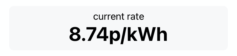
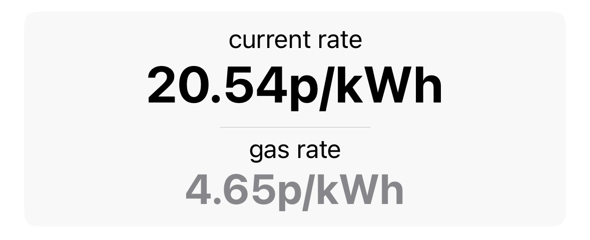
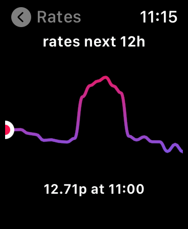
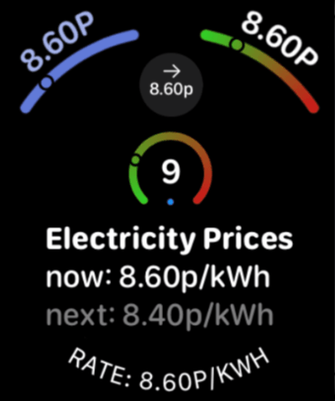
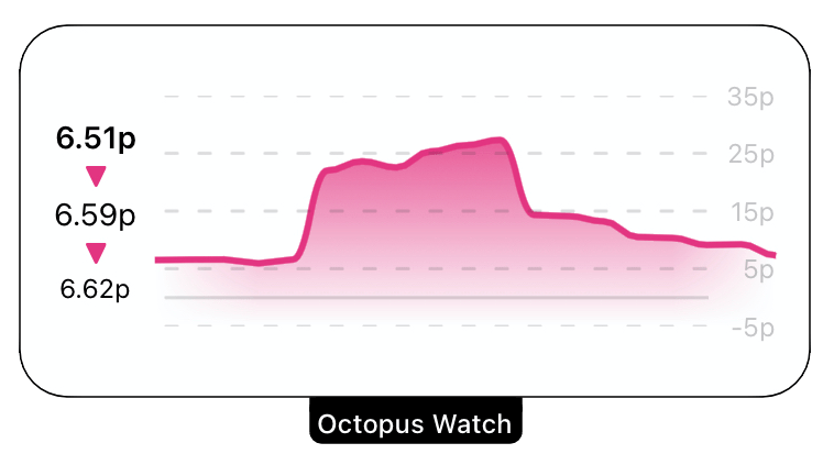
The Rates tab in Octopus Watch shows you the current unit rate at the top of the page. This is the unit rate you would pay if you turn on an appliance right now.
 If you are on Gas Tracker, then the app also shows you today’s gas price.
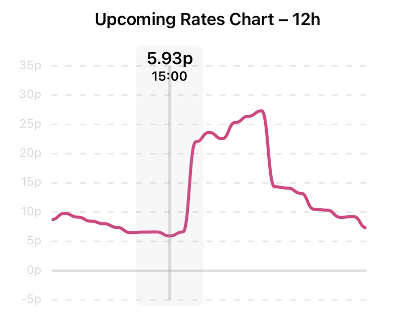
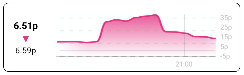
The upcoming rates are shown towards the bottom of the page. An interactive chart gives a bird’s eye view of how the rates evolve over time. You can tap the chart to see the price at a particular point, or drag left and right on the graph to find the price at a given time.
You can enable shading to highlight each alternating 4 hours in a day. To do so, go to Settings → Options and toggle Show 4H Shading.
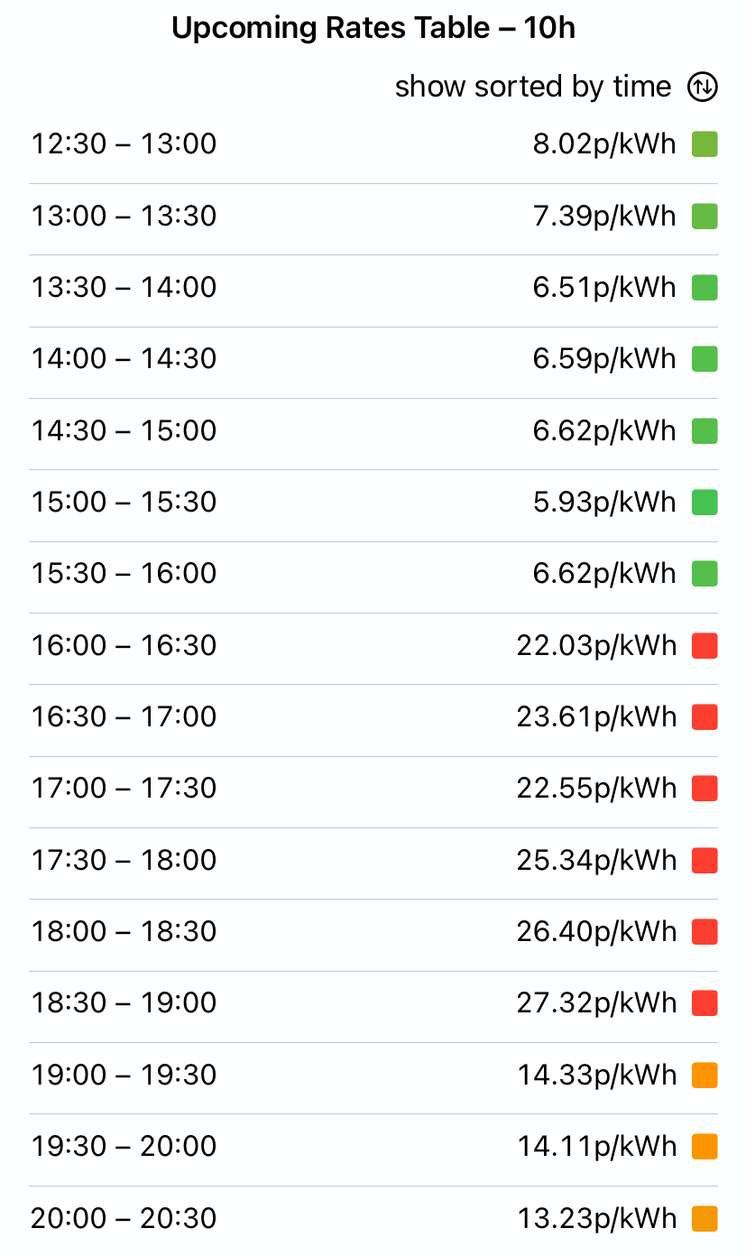
For a more detailed view you can look at the Upcoming Rates Table at the bottom of the page. This table shows the current and upcoming unit prices for each half hour slot. In addition, the table uses a color code to indicate low prices (green), high prices (red) and moderate prices (orange). As desired, you can tap on show sorted by time to change to show sorted by price to quickly see which half hours are the cheapest.
Would you like to see fewer or more rates in the table? In Settings → Options you can select the desired size of both the graph (24h, 48h) and the table (gone, 24h, 48h).
Finding the Best Slots
Most of the time, you really just want to know what the cheapest slots to run your appliances. Many appliances come with (simple) timers that allow us to plan our electricity usage. Octopus Watch makes finding the best time to run an appliance as easy as swiping a slider. To find the cheapest slot, drag the slider on the middle of the rates tab to the desired time  . As you drag the slider, the amount of time requested to run an appliance will update
  . In addition, you immediately get the best time to run the appliance
  , as well as the average unit price for running the appliance during this slot
  .
.
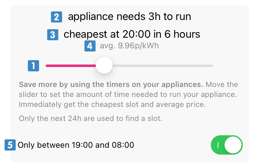
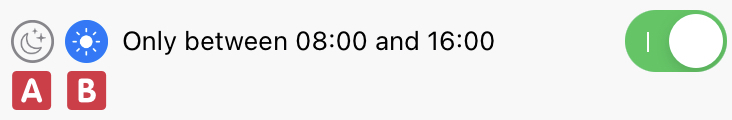
If you want to find an overnight slot  , or a daytime slot
  , you can toggle the option to only search between certain hours
  . The result will always be a slot that starts and finishes between the given time.
Sometimes no slot is found. This can happen when you are looking for e.g. an 8 hour slot but only 6 hours are known. Also be careful when you adjust the overnight hours. If you look for a new slot at 7AM, but have overnight hours enabled until 8AM, then no slot will be found that takes more than 1 hour.
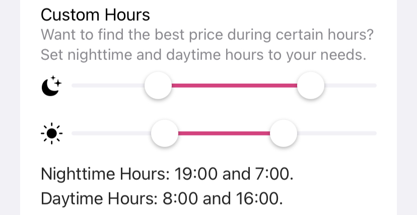
You can change the times for the nighttime and daytime slot by tapping on the Settings tab, then tapping on the Options button. Scroll down until you reach Custom Hours in the Rates tab section. Drag the left thumb on the slider to change the starting time. Drag the right thumb to change the ending time of either the nighttime or daytime slot.
Different appliances have different timers. By default, Octopus Watch shows you when the best slot starts (in hours and rounded down, to avoid being hit by 4PM peak pricing). Octopus Watch also shows you at what time a slot ends. If your timer requires you to provide the end time in hours, you can go to Settings → Options and enable the See When Slot Ends toggle.
Keeping Tabs on Usage
The Electricity tab is only available if you use the API Login method. On the Electricity tab you see an overview of your electricity consumption for each day over the last 4 months. Summary rows are available for both 7 days and 28 days. With a subscription you’ll see up to a full year of history, as well as summary boxes for 7, 14, and 28, and then for any subsequent month.
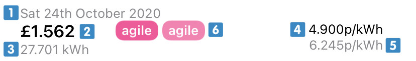
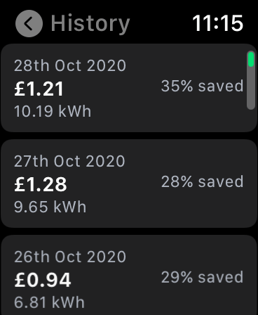
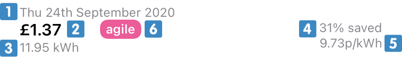 Every row in the Electricity tab corresponds with a day with complete consumption data. You can see the actual date , the total cost for the electricity on that date , and your total electricity consumption on that date in kWh . On the right hand side you find the savings compared to the current standard variable rate and your average unit cost for that date . A tariff label is presented
  to quickly show you the active tariff on any given day.
In the Options screen, accessible through the Settings tab, you can choose whether you want to round the numbers down to two decimals (less cluttered) or whether you want to stick to 3 decimals (more information). There is also a toggle in the Options screen to show the current unit rate and standing charge for the standard variable rate on the Electricity screen for easy comparison.
If you want to verify if you are on the best tariff you can use the the Smart Compare functionality. You can find the Compare button at the top of the Electricity tab.
The app integrates weather data so you can see how your usage is affected by temperature. By default, weather data is shown on the Gas tab. If you don’t have a gas meter, or you have the Gas tab disabled in the app, you’ll see the average temperature of the day listed for each day at the bottom right.
Missing information is a problem inherent to smart meters. Whenever Octopus Watch cannot get full and valid information for a given day it will now show that day in the Electricity overview. This ensures that you are aware that information is missing. More information on the issue of missing days can be found on this dedicated page.
Users with Export
If you also have an export meter then the screen looks somewhat different.
 Every row in the Electricity tab corresponds with a day with complete consumption data. You can see the actual date , the net cost for the electricity on that date , and your net electricity consumption on that date in kWh . On the right hand side you find the average import unit costfor that date and your average export unit cost for that date . Tariff labels are presented to quickly show you the active tariff on any given day. The first label is import, while the second is your export.
Week and Month Summaries
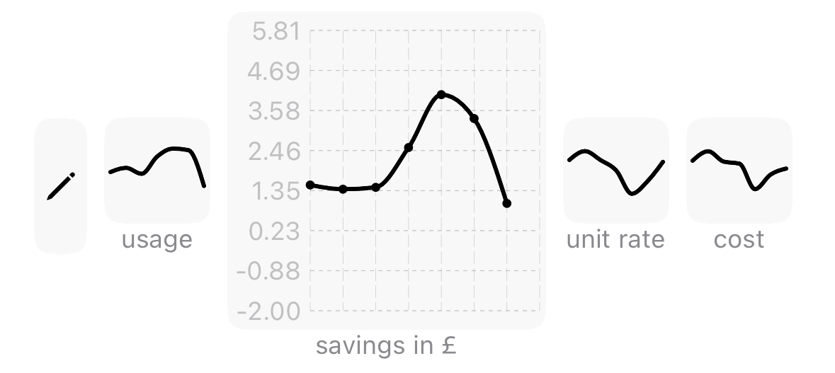
 Summary boxes are always interjected for 7 days and for 28 days. Some days can be outliers with big savings, or hardly any savings. The summary boxes instead provide you with the averaged usage over a given period of time. This provides you with more accurate information. This includes the average daily cost in pounds and the total cost in pounds for the given period. The bottom row provides you with your average daily consumption in kWh, your unit rate for the given period, and your savings compared to the standard variable tariff.
If you also have electricity export then the summary boxes are tailored to your setup.
 You can see your average daily net cost and the total cost for all the days included in the summary . Separate summary rows are available for import and export . Each row lists your average daily import/export in kWh and your average unit cost over the summarised period.
Micro Metrics
Micro metrics allow you to see trends in your data at a glance at the top of the Electricity tab.
 A full overview of the micro metrics capabilities and options is available on the micro metrics page.
Gas Data
If you have gas data – you have a gas meter and you had an active contract in the last 12 months – then a similar tab will be available for gas. The gas tab works similar to the electricity tab and will look familiar. If you have a gas tab, this is where you will find the average temperature for each day. By default the app shows the data in KWh. If you prefer m3 you can either change this in Options, or long press on the kWh/m3 value on the right-hand side.
The conversion from the metered volume that a gas meter uses to the kWh you’re billed on relies on your calorific value. This value is unique to you and your area, and it is listed on your latest Octopus Energy bill. In Settings → Options you’ll find the option Calorific Value. Set this value to the calorific value from your latest bill to get accurate kWh and cost calculations. Your calorific value will change over time, so check and update the calorific value occasionally to ensure correct values are calculated. The app by Octopus Energy does not allow you to set the calorific value and instead uses an average, which will give inaccurate values that deviate from the values in Octopus Watch.
Notifications
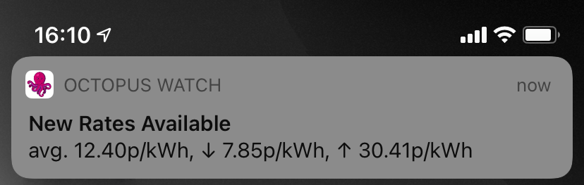
Agile rates for the next day are usually announced by Octopus Energy at around 4 pm. There may be days when rates are not announced until much later in the day, sometimes even as late as 9 pm. Octopus Watch can notify you as soon as new Agile rates become available. These notifications include additional information such as the average, lowest, and highest unit price for the next day.
To enable notifications go to the Settings tab, tap on Options, and enable the option Notify on New Rates.
The first notification on iOS will be a silent one, and iOS will give you the option as to whether you want to keep seeing these kind of notifications. Notifications on Android are by default set up to be silent. You can change the notification options in the Android settings screen.
If you have the Octopus Watch app open then notifications will not be shown. Notifications are only shown when your device is in standby or you are using another app.
Notifications are sent out independently from the app. You get a notification of new rates and basic stats as soon as new prices are available. When you tap a notification the app may not immediately show you the new rates as it needs to retrieve the rates itself from the Octopus Energy API. Octopus Watch carefully manages updating the app to avoid overwhelming the Octopus Energy API. If a request for updates fails the app will keep trying, but will do so more slowly. Instead of immediately tapping on the notification – and getting stuck in this queue – it is often better to wait a few minutes when fewer people are requesting the new rates.
If you have a subscription you can choose to only get notified when the new rates go below a given unit price. Click here to read more. Subscribers can also see predictions, which are continuously updated throughout the day and often align perfectly with the newly published rates.
Apple Watch
Octopus Watch has a dedicated app for the Apple Watch. The app can be installed on the Apple Watch without having Octopus Watch installed on your iPhone. This does mean that the Apple Watch app needs to be set up by itself by providing your API key, MPAN, and meter serial number. For convenience the Apple Watch app will try to sync this login information with your iPhone to simplify the setup procedure.
The Apple Watch app provides you with the basic functionality you expect to find in the iPhone version. This includes the current rate, the slot finder to quickly find the cheapest time to run appliances, and a basic history overview.
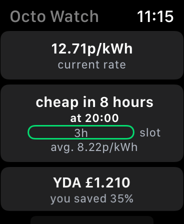
With the app open on the main screen you can turn the digital crown up and down to change the selected slot size. You immediately get the best time to run an appliance for the indicated hour.
The top box on the main screen shows you the current Agile rate. To see an overview of the rates to come tap this top box. In the screen that appears you can use the digital crown to move to a spot on the graph for which you want to see the rate, or simply tap the screen.
The bottom box on the main screen shows you the cost of yesterday’s usage. To see more of your history tap this bottom box. The screen that appears shows you an overview of the last two weeks along with basic statistics.
For even quicker access to the current Agile rate the Apple Watch app comes with a smorgasbord of complications to fit your style and preference.
Some complications have a slider indicating how high or low the current rate is with respect to the known rates for the next 24 hours. If the dot on the scale is further to the left then this indicates a cheap rate. Is the dot to the right then the current unit rate is expensive. Some of the sliders also have a colour coding. Green means lower prices while red means higher prices.
Some complications come with a symbol. A dot or flat line indicates that the unit remains stable for the next half hour. An arrow pointing up means that the unit rate for the next half hour is significantly higher than the current unit rate. An arrow pointing down means that the next unit rate is significantly cheaper – so it is better to wait just a bit longer to turn on your power-hungry appliances!
Widgets
Most of the information in Octopus Watch is designed to be glanceable; you can get the information you want in just a matter of seconds. Widgets are the pinnacle of this idea: you have the latest rates available directly from your home screen.
Widgets – Android
Follow these steps to add a widget to your home screen on Android:
- Long press on an empty space of your home screen.
- Select the option Widgets.
- Scroll down until you find the Octopus Watch widget.
- Tap and hold on the widget, then drag the widget to your home screen.
Depending on your version of Android these instructions may be slightly different. The instructions above apply to the base version of Android 10 and Android 11. Please read up on the instruction for your particular launcher and Android skin to know how to add widgets on your device.
Widgets – iOS
Follow these steps to add a widget to your home screen on iOS:
- Long press on an empty space of your home screen.
- Tap on the + button in the top left corner.
- Scroll down until you find Octopus Watch, and tap on it.
- Choose the desired size and tap on Add Widget.