Subscription Extras
 Octopus Watch comes with an optional subscription that unlocks a number of powerful new features. These features help you plan your consumption better to save more on Agile. The subscription is available as both a monthly (£1.79) and a yearly option (£11.99). That’s less than £1/month! Many users end up saving (much) more than this on their electricity bill by using the app and its advanced features.
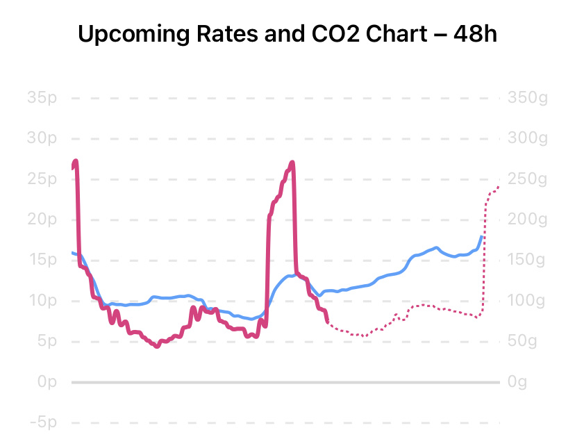
Rate Predictions
Ever wondered what the future may hold? With the rate predictions you can see what the rates are for the next 24h (accurate) or 48h (less accurate), even if the rates are not available yet from Octopus Energy.
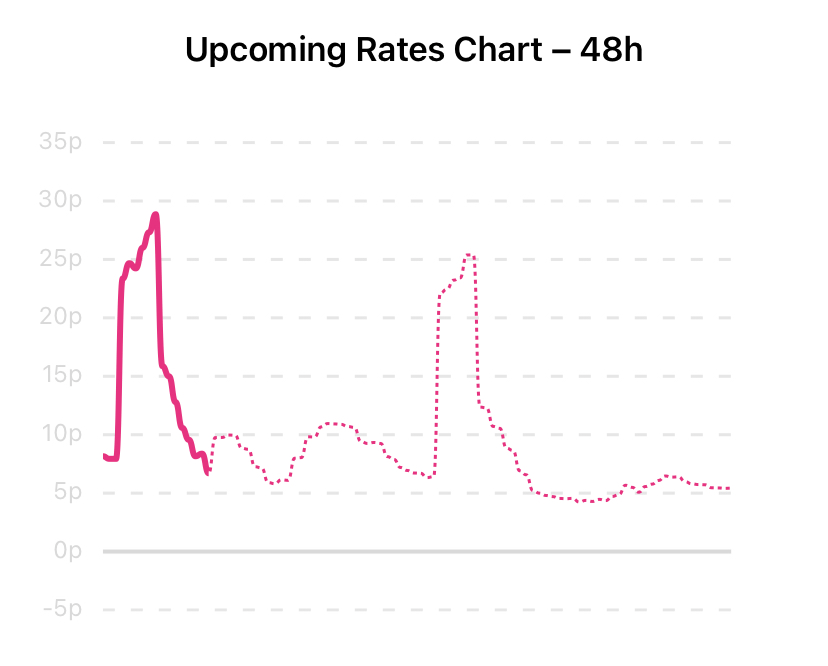
Rate predictions can help you plan your day better. Ever pondered whether you should quickly do another load of laundry between noon and 4PM, or wait for better prices overnight? Using the predicted rates you can quickly get an estimate of what overnight prices will be. Rate predictions are available both for Agile and (Electricity) Tracker.
Predictions are continuously updated to provide you with the most accurate estimates. A total of 4 models are used, each requiring more data yet providing more robust predictions. This makes it possible to provide you with an idea of what the prices will be as much as 48h in advance, while still providing prices you can rely on for the next 12-24h. The predictions you see in the app are always the latest and most reliable prices known at that time. In general, predictions are updated roughly every 5-15 minutes.
Rate predictions are just that; a prediction. Their accuracy increases closer towards 4PM as electricity availability and weather data stabilises. Predictions can provide an invaluable benefit when used as a tool to plan your usage. The 24h predictions are designed to be stable. The 48h predictions are more prone to errors.
Want to know how the predictions come to be? Check out the dedicated page that explains how you can best use predictions, and how the prediction engine Nix works.
How predictions are shown and used is up to you. The Options screen has a dedicated section for predictions. To use predictions you need to enable the  Show Predicted Rates option. The slot finder can also use the predicted rates to find the best slot by toggling on
  Use Predictions for Slots. To ensure that you don’t overpay the slot finder only uses the reliable 24h predictions.
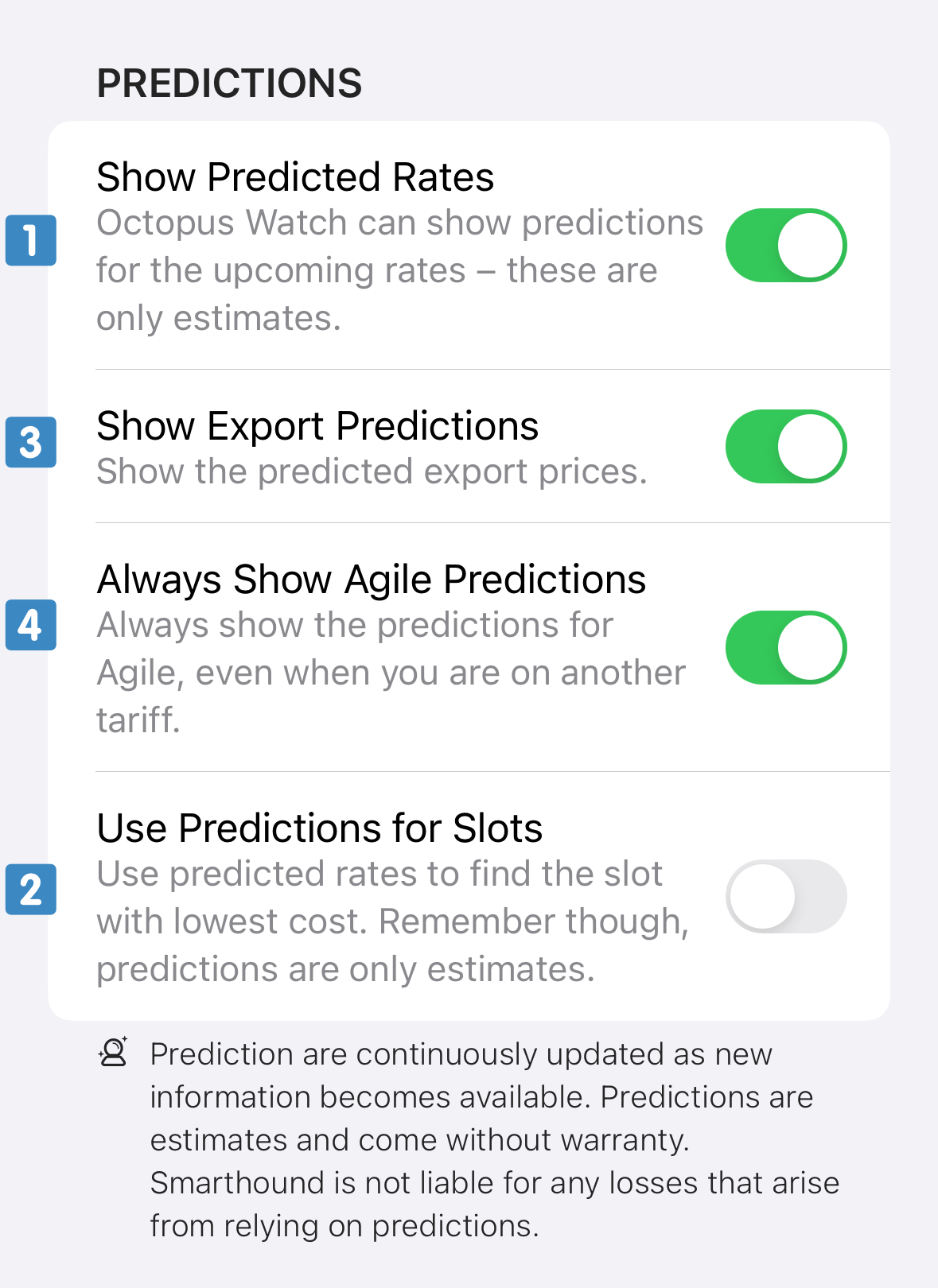
If you are not on the Agile tariff, you can still choose to see the Agile predictions along with the prices for the tariff you are currently on. To do so, enable the option  Always Show Agile Predictions.
Finally, if you also have export, you can also get export predictions. To see export predictions make sure you have the option Show Export on Rates Tab turned on, and enable the option  Show Export Predictions.
Predictions for the day after tomorrow rely heavily on weather forecasts. Similar to how weather forecasts can turn out to be unreliable — particularly during stormy weather — the 48h rate predictions can be unreliable when the weather is erratic.
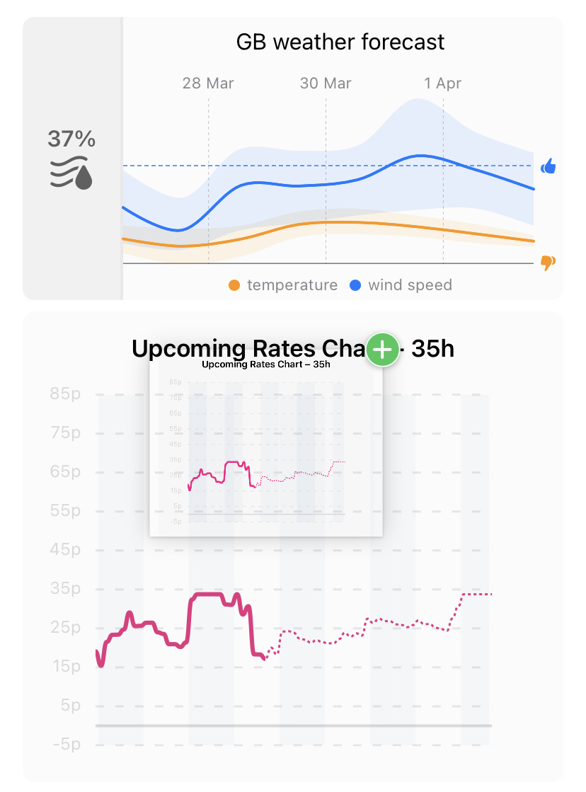
Weather Integration
Octopus Energy uses a bespoke weather solution to provide you with up to 5 years of historic weather, and up to a full week of forecasts across Great Britain. These forecasts can be used in conjunction with the detailed rate predictions to plan ahead on tariffs such as Agile and electricity tracker. You can add this card to your Rates tab by going to Settings → Options and toggling Show Weather Chart.
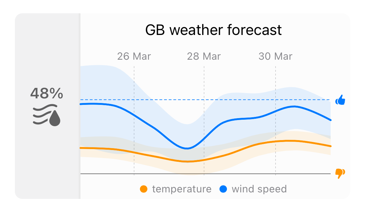
The forecast shows you the wind and temperature predictions for the upcoming week across Great Britain. The blue line represents wind, and the higher it goes, the more wind is expected. The forecast also has a dotted blue horizontal threshold line. If wind speeds are above this line, it means there’s a good chance that the wholesale prices for electricity will be favourable. The orange line is all about temperature. Wholesale prices tend to be worse when the orange line drops below the gray horizontal threshold line.
Favourable prices can be expected whenever both the blue line is (fully) above the blue threshold, and the orange line is (fully) above the orange threshold. This is just a forecast, not a prediction. Strong winds tend to have a bigger impact on prices during the weekend, so this is an example of a factor you have to account for.
Saving on Dehumidifier costs
Do you have a hygrometer in the house? The value on the left can help you to air your home cheaply. Humidity is measured as a value relative to the temperature. As such, particularly during winter, humidity in weather reports isn’t useful as it relative to near-freezing temperatures. The value on the left is the humidity relative to the indoor temperature (set this value in Settings → Options). When the humidity is 90% outside, at a temperature of 5°C, the app recalculates this for you to 42% at 19°C. If your indoor humidity is higher than this you can open up the windows for a few minutes to drop to an ideal indoor humidity of 40-55%. This is more energy-efficient than turning on a dehumidifier. And it reduces your energy costs, as drier air is less costly to heat. Most importantly, maintaining an indoor humidity between 40–55% creates a healthy indoor climate where many pathogens struggle to survive.
CO2 Integration
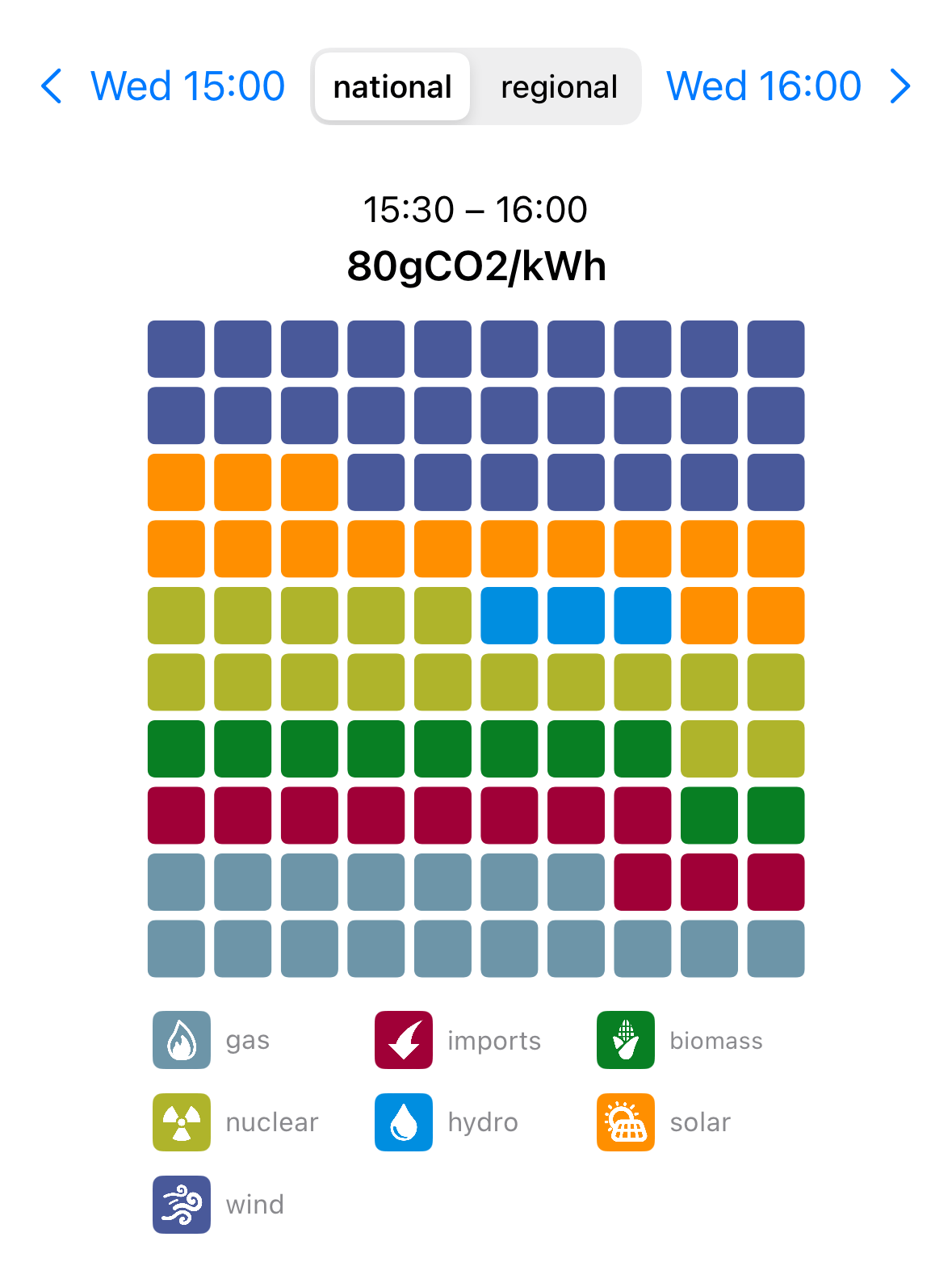
With the CO2 integration you can see an estimate of the carbon impact of every upcoming half hour, find slots with the lowest carbon impact, and see a summary of your carbon footprint based on your usage data. These values are obtained through a service run by the National Grid. Whitepapers are provided by the Carbon Intensity service and detail how the national and regional values are calculated. These whitepapers are available through these links.
To see the impact and fuel composition of an upcoming half hour slot you can tap on any row in the Upcoming Rates Table on the Rates tab. This opens a new screen where you can select whether you want to see either the national or region carbon intensity as well as a pie chart that shows you the energy composition for that half hour. The pie chart is interactive; you can tap any slice to see further details such as the percentage and the type of fuel.
CO2 integration also extends into the detailed reporting, which is discussed in the next section.
If desired, the best slot to minimise your carbon footprint for running appliances can be found. There are two ways to active this mode. You can tap the current unit rate banner at the top of the Rates to switch to CO2 priority mode. Alternatively, you can toggle the CO2 priority mode in the Options screen found in the Settings tab. This screen furthermore allows you to select whether you prefer to use the national or the regional CO2 levels. When CO2 priority mode is enabled the slider on the Rates page helps you to quickly find the best slot to minimise your carbon impact. Furthermore, an extra line chart is shown with the CO2 values for the next 24h or 48h.
Not interested in CO2 information? You can hide it throughout the app. To do so, go to the Options screen in Settings and enable the option Hide All CO2 Data.
Organise Your Rates Screen
As a subscriber you can reorganise the cards on your Rates tab to match your preferences. Every card can be hidden or shown from Settings → Options. To reorganise the cards on iOS you can grab them by their top corner and drag them to the desired position. On Android, there is a dedicated drag handle on the top right of the card. Tap and drag it to move the card to another position.
Detailed Reporting
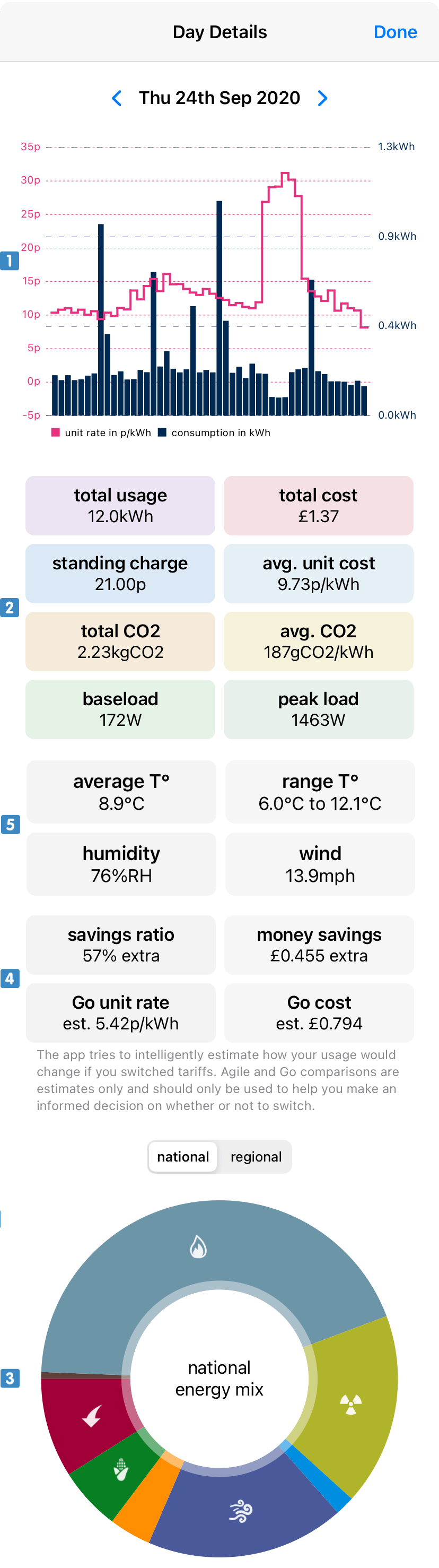
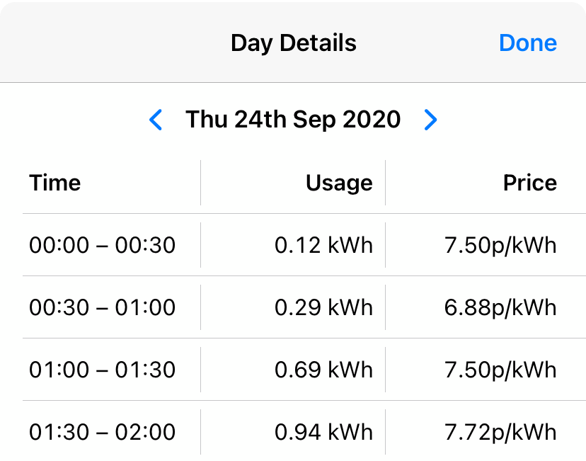
Detailed reporting allows you to both see individual Day Details, and to generate comprehensive energy reports. To see the Day Details you can tap on the respective row in the History screen for which you want to see the details.
The page that opens shows you:
- a graph with both your usage as well as the Octopus Agile rate for each half hour slot;
- various additional statistics such as your baseload and the CO2 emissions for your usage;
- the national/regional fuel composition for your electricity usage;
- estimates of the unit rate and cost for the Go tariff if you are currently on Agile, or vice versa;
 weather statistics for the given day (if you don’t have a gas connection).
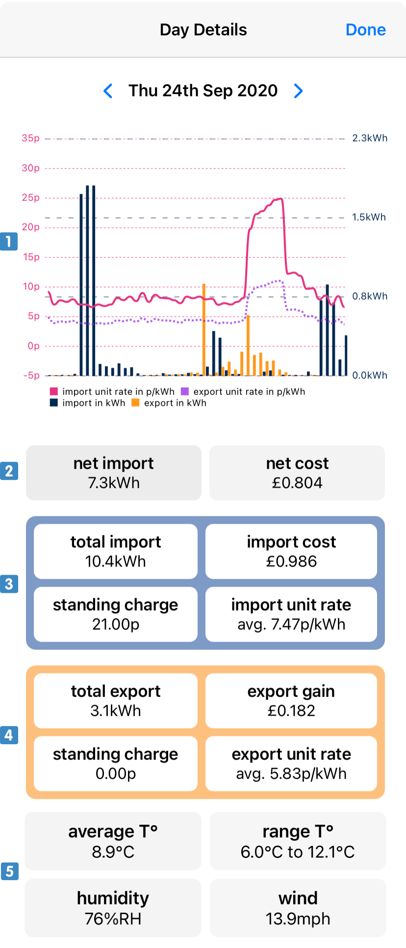
If you also have export the overview is different and provides you:
- the same graph that now includes both your electricity import and export, as well as your import and export unit rates;
- your net import/export and your net cost/gain;
- statistics related to your electricity import;
- statistics related to your electricity export;
- weather statistics for the given day (if you don’t have a gas connection).
CO2 information is shown in the same way as discussed above. The CO2 information always relates to the electricity you imported and does not take your export into account.
Tap the graph to see the details of your electricity consumption. The screens that opens shows, for each half hour slot, your consumption in kWh and the applicable unit rate. If you also have export this information will be further broken down to show both your import and export.
You can long press on the unit cost on the right hand side to switch to cost in pounds. Long press again to switch back to the unit cost. Showing your savings or savings percentage is not possible when you also have an export meter.
Energy Reports
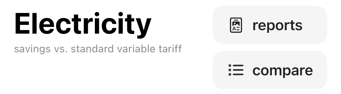
As part of the detailed reporting you can generate as many energy reports as you want, for any time period over the last 4 months. To do so, tap on the reports button in the top right corner of the Electricity/History tab.
The screen that pops up allows you to select a date range for the report. If you want, you can save the start date for easy access to subsequent monthly reports in the future. Tap Generate (iOS) or Create energy report (Android) when you are happy with the selected date range.
The generated report summarises your energy consumption for the selected date range.
- The graph shows, for every half hour, your average consumption and the average Agile Octopus unit rate. The vertical error lines indicate the spread of the average consumption. A long line means that, for this particular half hour, you sometimes have very high and very low consumption. Very short lines indicate that your consumption at this half hour is typically the same.
Info
A good usage pattern for Agile Octopus has low consumption bars during 4PM–7PM as well as low error lines during 4PM–7PM. In addition you want to see long error lines overnight and from noon–4PM when prices tend to be lowest.
- Octopus Watch analyses your usage and can tell you if your usage and/or costs are going up or down during the selected date range.
- Your average unit rate and standing charge is calculated to make it easy to compare the prices you pay on Agile Octopus with the prices on most other tariffs.
- The report shows your factual unit rate. This is the net price you paid for each kWh consumed – this is higher than your unit rate as it includes your standing charge.
Baseload calculations are inaccurate if you have electricity generation or electricity storage installed. If you have an active export meter then this section will not be shown. If you did not add your export meter during setup, but you have generation or storage, then the baseload number you see here is likely wrong.
For every report that spans 2 or more days there is an additional infographic page. The infographic provides you an ever deeper insight in your usage. Full documentation on the infographic and its various components can be found on the dedicated page.
Extra Options
A number of extra options are available in the Options screen found in the Settings tab for users who subscribe. Most of these options relate to extra functionality unlocked with the subscription. Some options, such as Include Standing Charge and Highlight Cheapest in Table, are only available to subscribers. Other options, such as Export CSV include additional data for subscribers. The functionality of these extra options is described in the Options screen itself.
Extra Functionality
New functionality is continuously added to Octopus Watch. Some of these features are still under development. This includes the notifications, which are currently trickling into the apps on both iOS and Android. Read on to find out how notifications work on the different platforms and how they can simplify your life.
Expanded Micro Metrics
Subscription users have access to more micro metrics, and can see micro metrics statistics over a longer period (14 days and 28 days).
More Compare Options
As a subscriber you can compare with more smart tariffs on the Compare screen. In addition, since subscribers collect a full year of data, you can compare over the period of a full year instead of the base user maximum of 4 months.
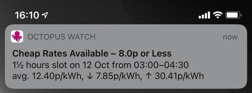
Rate Notifications
Octopus Watch can notify you when new rates are released by Octopus Energy. As a subscriber you can opt to only be notified on days when rates drop below a given price. To do so go to the Settings tab, tap on Options, then enable the option Notify on New Rates. The slider below can be dragged from left to right to pick the desired unit rate. Drag the slider to the far right to receive notifications on all days.
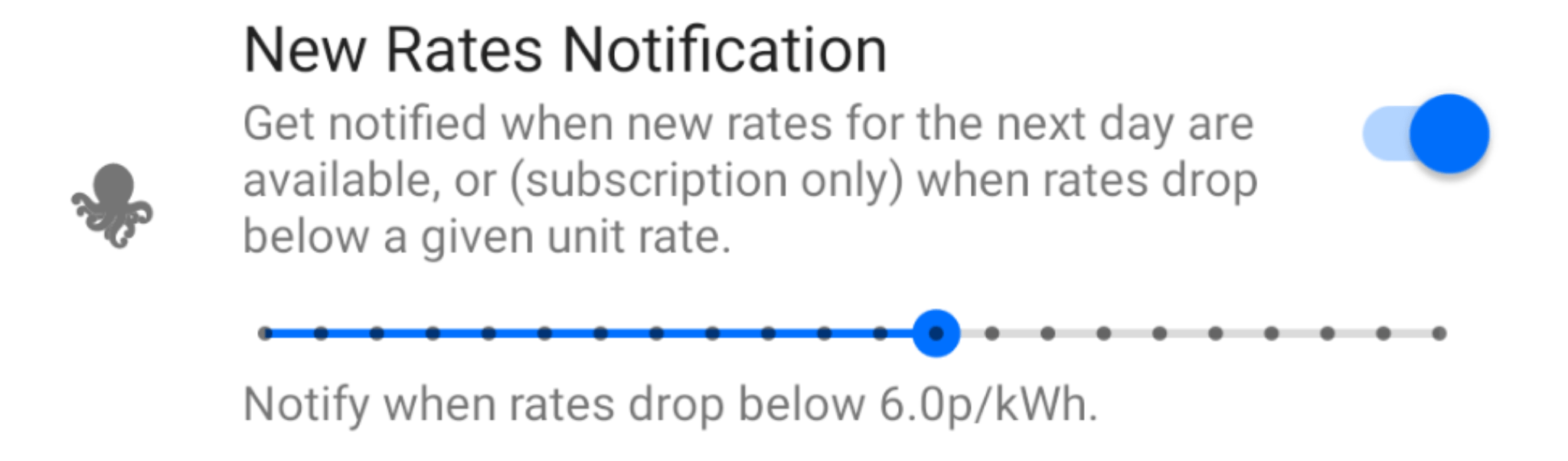
On iOS don’t forget to tap on Done to make sure the settings are enabled.
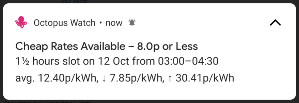
As soon as new rates become available and these are are at or below the indicated unit rate you will receive a notification. This notification includes the average, lowest, and highest unit rate, as well as the longest slot where rates drop below the desired unit rate.
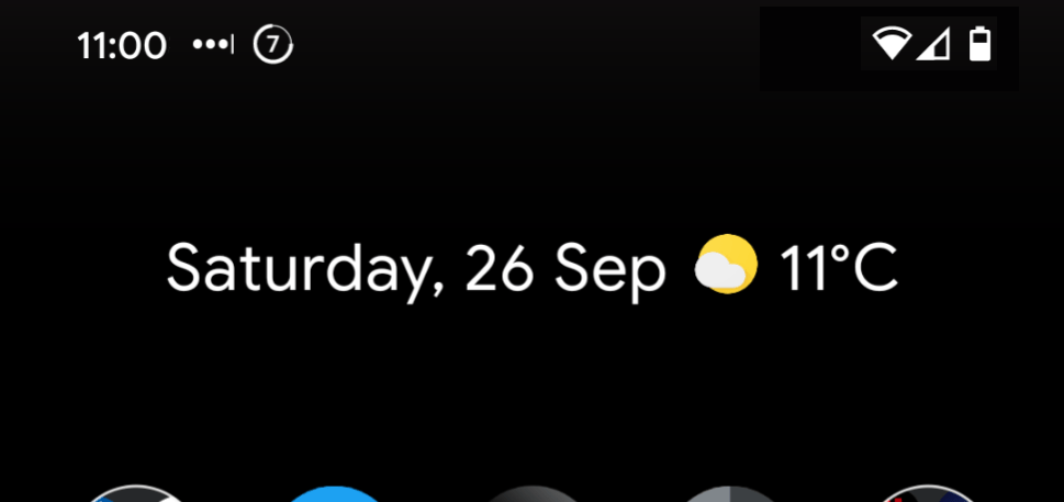
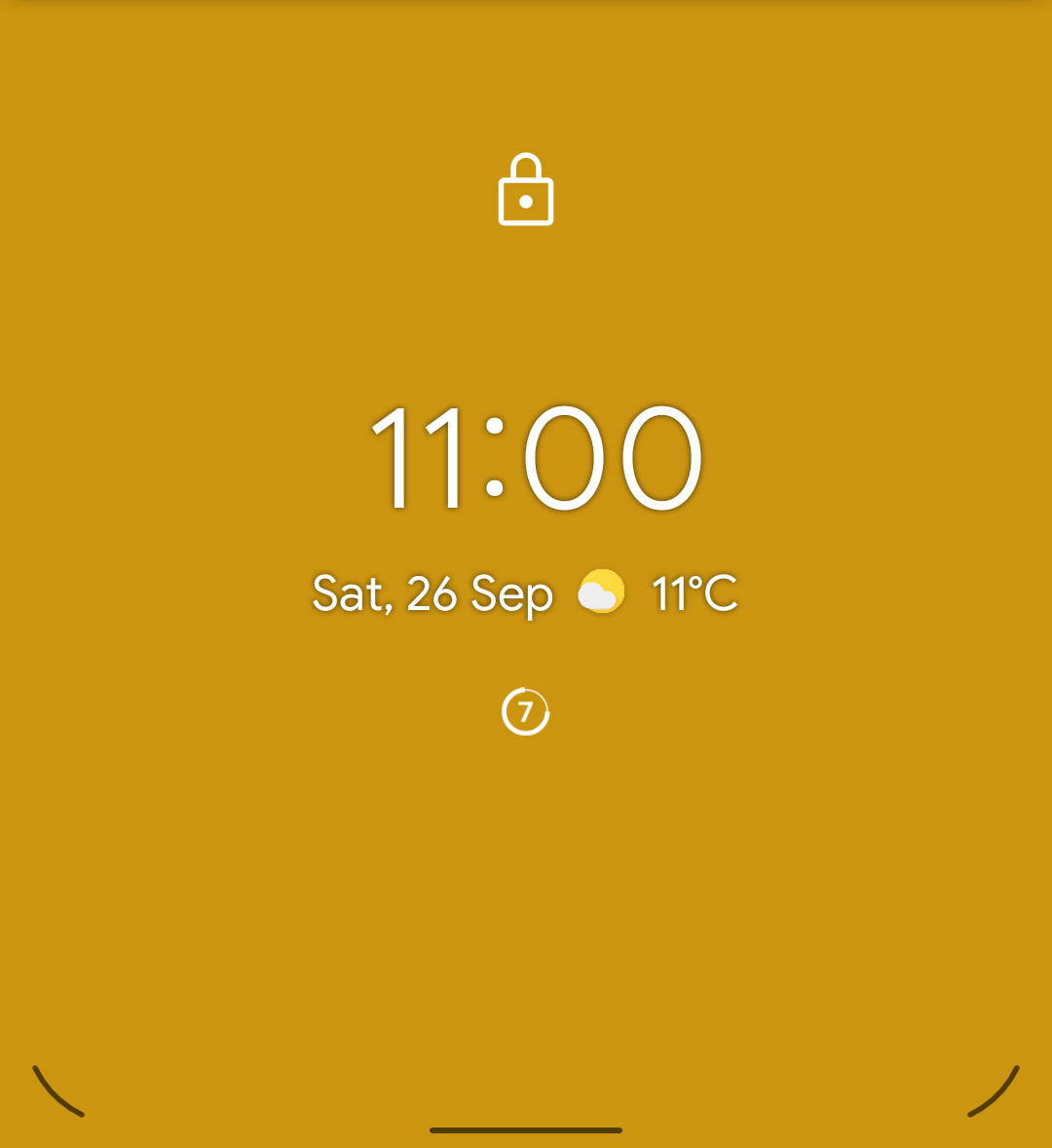
Extra Android Notifications
On Android the app can show a persistent notification with the current rate. This way, regardless of which app you are using, the app can keep you up-to-date on the current rate.
The value within the circle in the status bar shows the rounded down rate. The circle itself indicates whether the current rate is within the 25% cheapest rates for the next 24h, the 50% cheapest, the 50% most expensive, or the 25% most expensive. This corresponds, respectively, with one, two, three, or four filled quadrants.

Depending on the version of Android you are using the same icon notification can be shown on the lock screen (when using a Pixel phone or a Pixel Experience ROM), or it displays a more elaborate notification that also includes the next current rate.
Notifications are a default component in Android. The Options screen in the Settings tap provides you easy access to the configuration options for the notifications. If you use Do not disturb mode you may want to give the notification the ability to be shown even when Do not disturb is turned on. This way you can see the rate at all times. The rate notification will never use sounds or vibrate your phone.
Support Development
Can you believe it took close to a year of continuous work to get Octopus Watch to the app it is right now? It’s been a great journey, but at the end of the day everyone likes to get paid for their work. And there is no better way to show your appreciation than to subscribe! A full year is less than the price of one month of a standard Netflix subscription. Or three coffees in your favourite coffee place. Yet it means so much to me. It gives me a steady income – Thanks ! It shows that you love the app – Thanks ! And it gives me the chance to continue developing and maintaining the app – Thanks !