Micro Metrics
Micro metrics offer a quick, easy, and non-intrusive way to stay on top of trends in your data. They are fully customisable, interactive (tap it!), and ready to provide you with valuable insights. Each micro metric tracks a single metric for you, such as your usage, or your unit rate. And it show you how this metric have changed over time.
Customising Micro Metrics
You can edit the micro metrics bar by tapping on the edit icon the left-hand side. In the menu that opens you can see  the micro metrics that are currently shown and which are available to add. You can delete micro metrics (tap cross or bin icon), add micro metrics (tap plus icon), and rearrange the metrics by dragging them (using the handle on the right on Android).
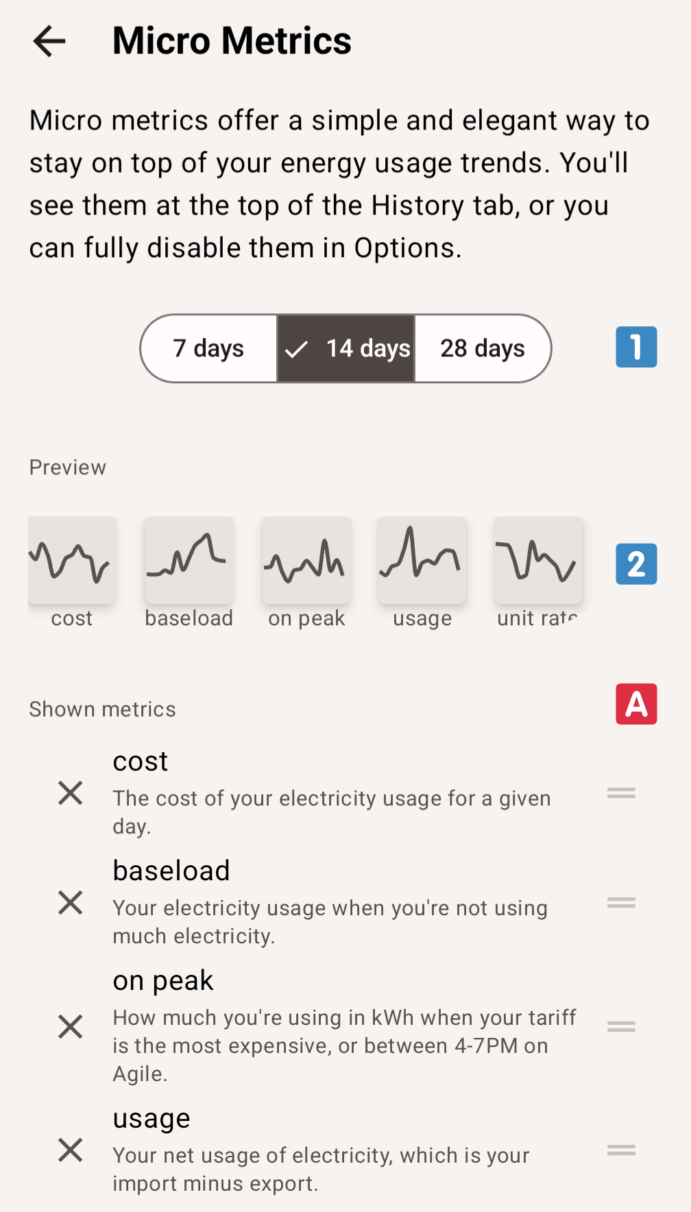
An instant preview shows you what the micro metrics bar will look like  . This bar is interactive, so you can tap micro metrics here to expand them too.
If you are a subscriber you have access to more metrics and to long-term micro metrics. Tap how far back each micro metric shows you trends by picking your preferred option  .
.
The available micro metrics depends on whether or not you are a subscriber. It also depends on whether or not you have an export meter, similar to how the Electricity/History tab and the Day Details adapt based on whether you have an export meter.
Using Micro Metrics
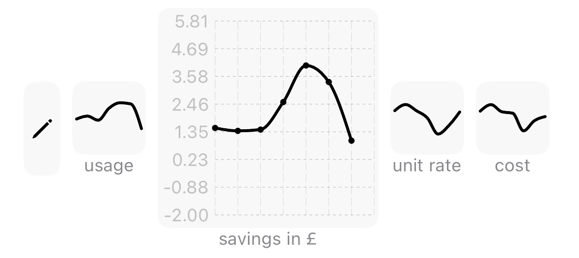
Each micro metric shows information for that metric from oldest (left) to newest (right). In their default collapsed format they are ideal for seeing trends, e.g. a quick jump in energy usage or your effects on trying to lower your on peak usage or baseload.
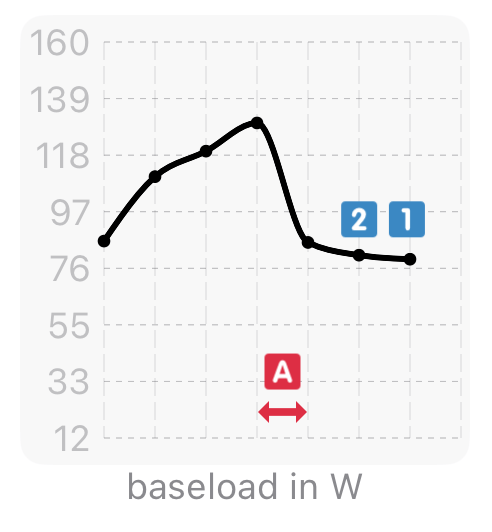
When tapped, micro metrics expand to show more detailed information. Each day with information is shown as a dot on the chart. The newest information is shown on the right . The day before tap is shown to its left , etc. The range of each micro metric is shown by the axis on the far left. The unit of these values is shown as part of the title at the bottom. In addition, a grid is drawn to make it easier to identify values and days.
Each column in the expanded view corresponds to a period of a day when you are a base user or opted to see 7 days. For the 14 days option, each column corresponds to a two day time span. Similarly, for the 28 day option, each column corresponds to a period of 4 days.